One of the best, easiest, & cheapest ways to build your web presence and PLN is a simple business card. My district doesn't supply cards for teachers or librarians so it's up to us to make that investment in our profession (and write it off our taxes!). For years I've been won over by Moo printing products and I redesign my Mini Moo cards about twice a year! As you can see above and below, my latest design is very Whovian, with a glowing flying Tardis! DISCOUNT OFFER: Get 10% Off Your First Moo Oder by Using This Referral Code!
But no matter where you get your business cards here's 5+ quick tips for making them out of this world!
Try Template ToolsIf you design your card from scratch, use a template. Moo provides templates for all their products. To use, I downloaded the template for the Mini Moo cards in .PSD format and using Photoshop Elements (For Mac & Win) and easily designed a card that fits all the parameters.
I totally failed my first attempts at this, designing cards without the correct pixel sizes, and the lure of the ability to have 100 different designs for each card with my Steampunk Second Life screenshots they just came out muddy! LOL But thanks to the PSD template, I got better! Plus, I decided to use just one image per box, which kept my branding more consistent. Once you design your card you just upload it to the Moo business card builder...re-ordering is easy, too!
Don't have Photoshop or want it super easy? Use the built-in design tools that Moo provides!
Ok, I totally stole "Happy Huesday" from my go-to source for all things colour schemes ColourLovers where I've
For example, The Mighty Little Librarian Tiffany Whitehead effectively uses pink, black, and zebra print!
A New Animated You!
Want instant branding & a fun addition to any business card? Try an Avatar! Here's a blog post and wikipage with 23+ easy avatar generators! It's a Cartoon, It's An Avatar, It's a New Animated YOU! For example, my friend Jennifer LaGarde recently revisited and re-designed her avatar. Squee! She added pearls to it! Love them, so classy! In her post she also shares some amazing avatar apps, drawing apps, and more! If you don't read her blog already, you should
One of the best things I've done for my business cards was to add a QR Code. Now, I know I've blogged a LOT about QR Codes, you have only to search this blog for all the posts, but a QR Code on your card makes getting to your blog, Twitter feed, professional website, or electronic portfolio as easy as an i-nigma smart phone scan!
To make a QR Code that has an image embedded in it, use QR Code Monkey as I described & showed in my Loo Reviews post last month. UPDATE: QR Code Monkey is my new favourite QR Code generator! Easy, free, no need to sign up - it's the BEST! You can use your avatar in the middle of your code or your picture! Branding is not the time to be shy!
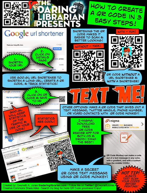
To create a QR Code you can follow my handy How To Make a QR Code in 3 Easy Steps comic tutorial.
When creating a business card, what kind of information do you include? I say, Go Reverse Mullet! Party on the front, business on the back. Make the front of your card FUN! Add that avatar & QR Code! But on the back add your full name, title, Twitter name, and email address. I don't add my cell phone number - you need to really know me to get that, plus it's usually on silent anyway. But that's your choice!
DISCOUNT OFFER: Get 10% Off Your First Moo Oder by Using My Referral Code! My latest card design is below with a fab glowing Tardi, my avatar, QR Code, & I ordered 200 in a glossy finish.
2016-- UPDATE My latest Mini Moo Card - gone with the Tardis!
Read why: Teaching Good - Branding Evil
OLD
Shipping!
 UPDATE: Want more graphic design tips for a slick sleek look? Check out my Digital Image Factory post & Slideshare!
 ISTE INFO:
I also just ordered over 100 of these round stickers promoting our TL Cafe webinar series, our hashtag, Google+ Community & Twitter #TLChat LIVE! series! While they last, find me at #ISTE13 & mention this post & I'll give you one! Woohoo!
Getting Ready for #ISTE13 in San Antonio? Hot Tips, Tricks, & Advice to Maximize Your Ed Tech Conference Experience Join Us Tuesday June 4th 7pm EASTERN for a FREE Webinar sponsored by ISTE SIGMS and the TL Virtual Cafe Tuesday 7pm EASTERN US time & our last and season finale #TLChat LIVE! at 8pm on Twitter the next hour! Participant Link
Resources:


Comments
Post a Comment