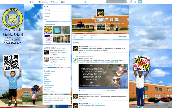
I recently worked a few nights madly and happily Photoshopping & designing a new Twitter look for our school's Twitter page! (it's still not perfect! & best viewed on a big desktop screen) when I heard that they're soon changing the look and design features of Twitter altogether! What the what!? Doh!
(It's HERE! See Update below!)
According to Mashable, they're making it look a lot more like Facebook. You know how I feel about Facebook, right?
Change Happens.
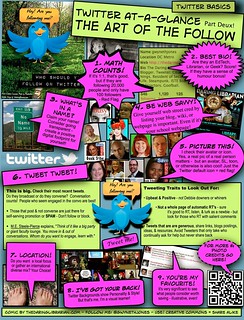
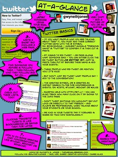 When Twitter changed their profile look a few years ago, I was Gwynnie on the spot figuring out how to make it look cool & I shamelessly shared my tips, too! Added to that my Twitter At-A-Glance and my Twitter: Art of the Follow comics, I try and keep up with Twitter trends. Heck I could do a collection of screenshots of Twitter's morphing looks. So, it comes as no surprise that they're changing it again. You probably won't notice much if you use a Twitter client like Tweetdeck or HootSuite, (in case you're wondering what I use - neither! ...I like the straight computer version of Twitter)
  but I gotta tell you - having a good looking Twitter background IS important! The first things I encourage new Twitter users is to break that egg and add a profile picture, write a banging profile description, include your location (at least country & time zone), add a link to some professional website (school, wiki, blog, Flickr, something that legitimizes you!) and to customize your Twitter background.
Why? Keep reading!
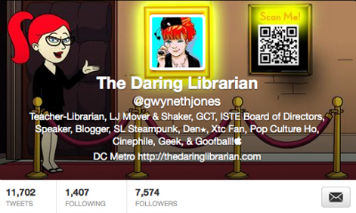 Dahling, You Look Marvelous!
 or Your Twitter Background is Your Branding Billboard
I'm working on a new preso & blog post (it's gonna be a long one!) about how to be a Twitter Ninja! But as a preview let me remind you that when people see your Tweets during a conference or an #EdChat or #TLChat they click on your name and POP goes up the profile quick view! That's why it's super important and a great opportunity to craft your brand or to at least look tech savvy and snazzy!
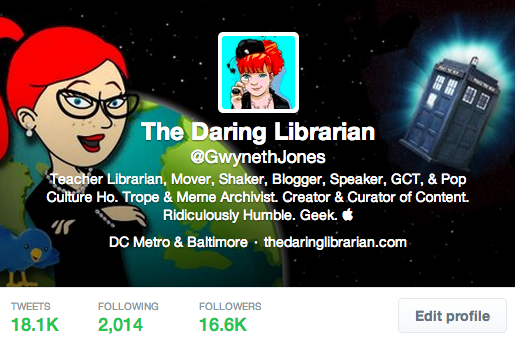
Mine looks like this now and of course I just re-designed it when I re-designed my school background. The DAY that the new design change was announced! [she bangs head on keyboard]
Twitter hasn't rolled out the new look to old users yet, only new ones! (I keep checking!) but if you want to get a head start you can design one that's 1500x500 but do note that the tool bar at the top will take up or cover about 55 pixels and the bottom toolbar 65 pixels.
UPDATE!!!!!
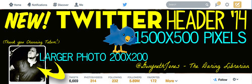
I feel like Steve Martin in the sophisticated oeuvre movie, The Jerk! I want to run out jumping up and down yelling "The new Twitter is here! The new Twitter is here!" instead of phone book! Just a couple days after I blogged about this (it's Wednesday 4/23) Any Twitter user who wants the new look can get it! See my new updated profile below. Then all the specs I guessed at...they're all pretty good! I still had to play with the graphic to get it right in all views!
I really like the new "Pinned" or featured Tweet! But don't forget to change it once in a while! Especially if you use Tweetdeck! The new look (I refuse to call it the Facebook look) is wide and expansive. Here's the full size screenshot!

UPDATE: They changed this! (of course!) DOH! The new look of the pop up is a squeezed down version of the whole main header.
Want a Template?
DOWNLOAD THE TWITTER HEADER PSD TEMPLATE HEREThank you @CTSocializer for this Template! You should also check to see what it looks like on an iPad, a big desktop, a laptop, a phone, well....everywhere you can! My new header doesn't look all that great on my iPad mini but looks OK on my regular iPad! It's a give and take. Until they change it again, right?! LOL
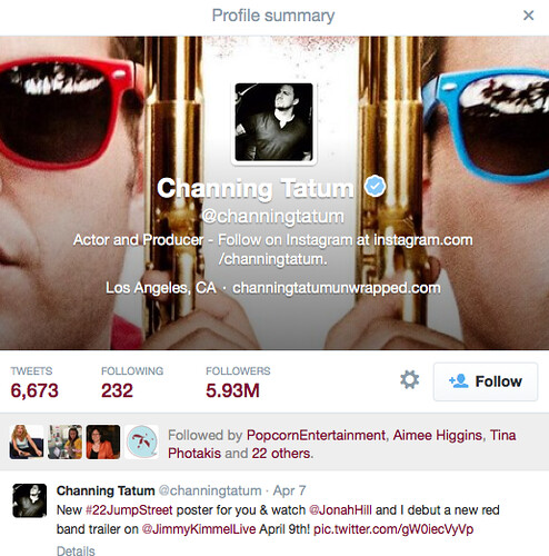
Thank You Channing Tatum!
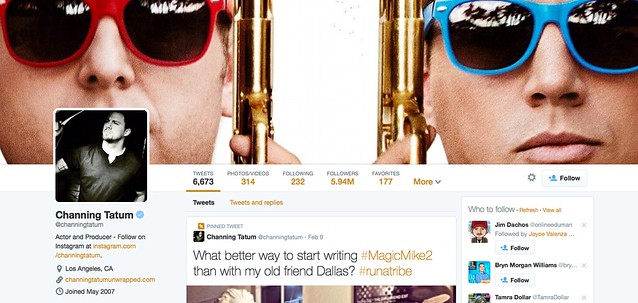
A choice few celebrities got the new look early, that's why I'm showing you Channing Tatum's Twitter profile as an example (and not just because he's amazingly funny, talented, & gorgeous!) So that's how I figured out by taking screenshots and measuring with Photoshop the image sizes - and also because there aren't any .PSD templates out there yet! Another thing to keep in mind when designing your new Twitter background when it's viewed in the chat pop up it will be cropped to a centered 515 pixels (do don't put anything too super cool on the sides like I did above!
Sometimes you gotta play with these things! View the full size of the example to get a better sense of how it's gonna look for you! Please note: all sizes are approximate - I'm a geeky amateur!
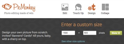
No Photoshop? No Problem!If you don't have Photoshop, use PicMonkey! When you get there select design then custom and put in 1500 and 500 OR upload a very big picture and crop it to 1500 X 500.
Just the (Approximate) SPECS!
- Twitter background image should be 1500 wide by 500 high
- Your profile picture will be a LARGER 200X200 pixels
- The image will be covered by the tool bar by 55pixels on the top and 65 pixels on the bottom
When viewed as a pop up during a chat the Twitter profile will center crop the image to 515 pixels and will show your profile text, location, and your website link.- UPDATE: Now the pop up is a small version of the whole main header! Makes it easier!
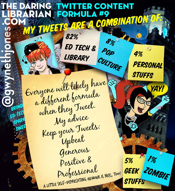
What's YOUR Twitter formula?
So dear readers...tell me in the comments
What did I forget?
Would you read a blog post or enjoy a preso on how to be a Twitter Ninja with all kinds of biased opinions & tricky tips?
Are you ready for this change?
What Twitter client do you use, if any?
Have you ever tried using Photoshop Elements? (It's hard!)
Resources:
6 New Features of the Twitter Redesign You Should Know About


Comments
Post a Comment